MyProsperity
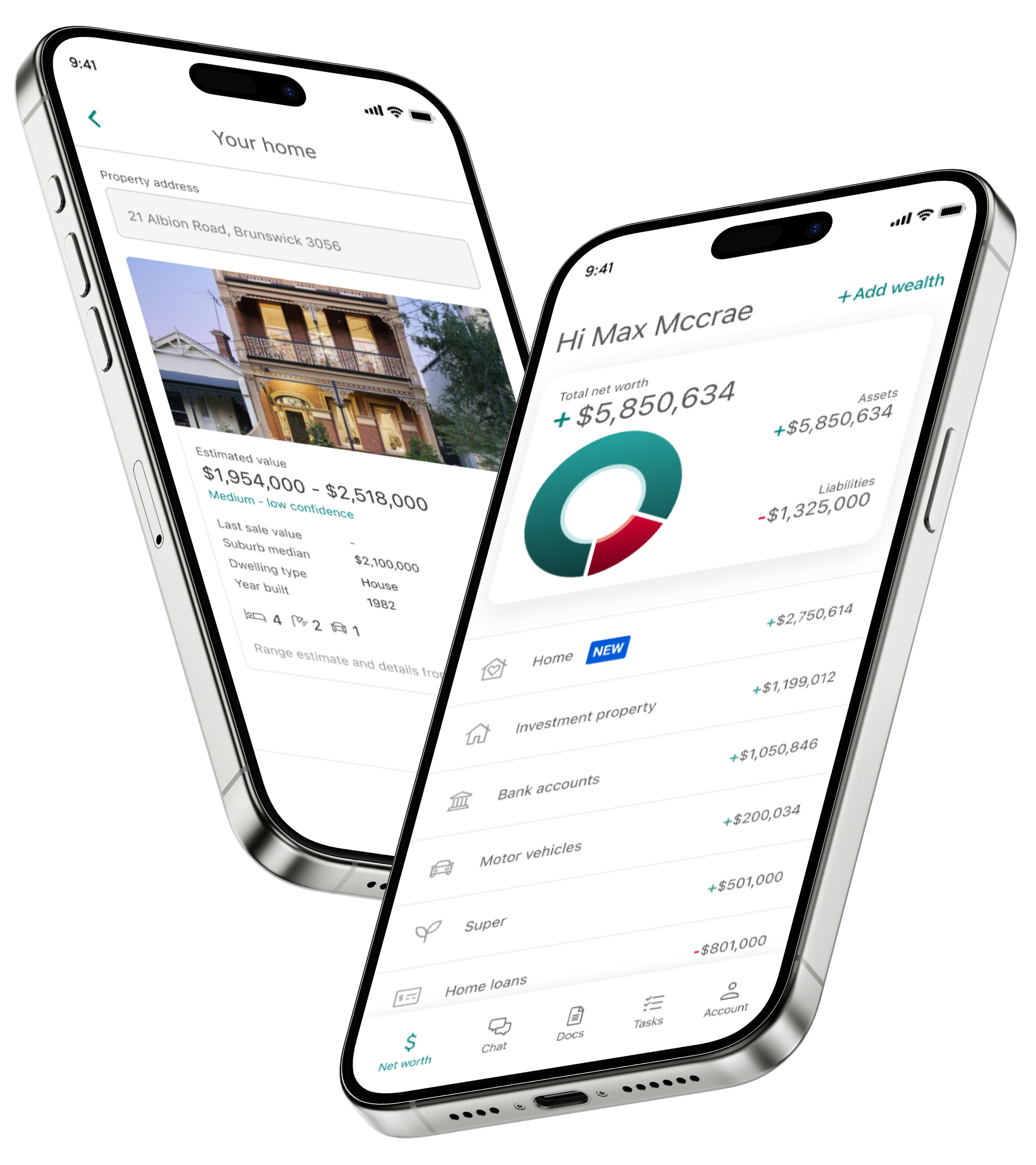
Client Net Worth
Company
My role
Responsibilites
👩🏻💻 UI Designer
⚫️ UI direction and design execution
⚫️ UI flow state mapping across 20 categories
⚫️ Component and interaction design
⚫️ Contribution to the MyProsperity App UI Kit
⚫️ Collaboration with UX, PMs, engineers, customer hub and senior stakeholders
Project overview
MyProsperity needed a major uplift of their ‘Net Worth’ feature within their client app. Used by accounting and financial adviser clients, accurate net worth data is critical for providing timely financial advice, especially around tax time.
However, the existing experience was built in a legacy webview: clunky, confusing, and disconnected from the app’s native design system. Our challenge was to redesign the flow into a fully native experience - streamlined, accessible, and intuitive, particularly for an audience predominantly aged 50+.
Problems with the legacy experience
Slow performance
Legacy webview caused slow, inconsistent interactions across devices.
Unfamiliar patterns
Poor use of mobile-first UI conventions.
No visual feedback
Lack of feedback, confusing call-to-actions, and frequent dead-ends led to user frustration.
Edge cases ignored
Errors, failed connections, or missing states weren’t handled.
Incorrect labelling and data
Inconsistent labelling and fragmented data input created confusion for users and inefficiencies for advisers.
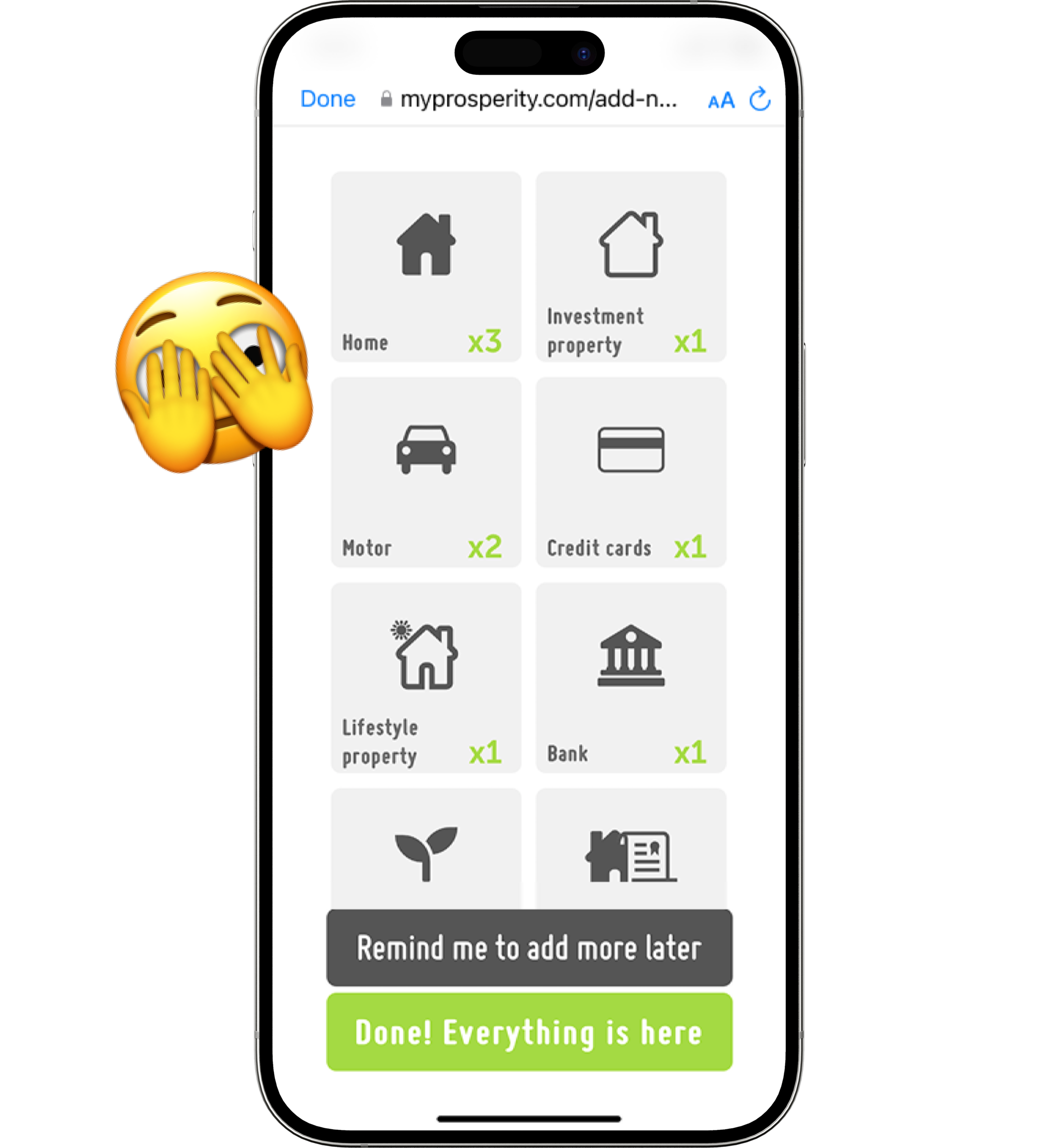
Old MyProsperity ‘Add Wealth’ category list
Design goals
Native experience
Deliver a native experience optimised for iOS and Android.
Familiar UI
Use familiar UI components and patterns to reduce cognitive load.
Design system contribution
Modernise UI components and patterns to ensure scalability, reusability, and consistency across the platform, while contributing to the evolution of the MyProsperity App UI Kit.
Feedback loops
Improve usability through better feedback, error handling, and navigation.
Accessibility improvements
Incorporate accessibility best practices and adhere to WCAG guidelines.
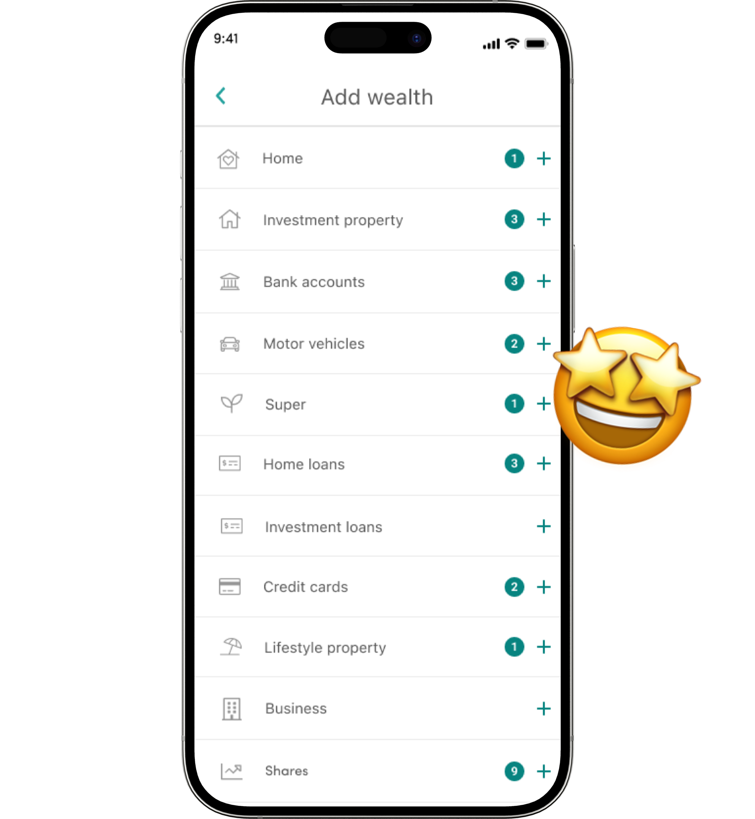
New MyProsperity ‘Add Wealth’ category list
Approach
UI state flows
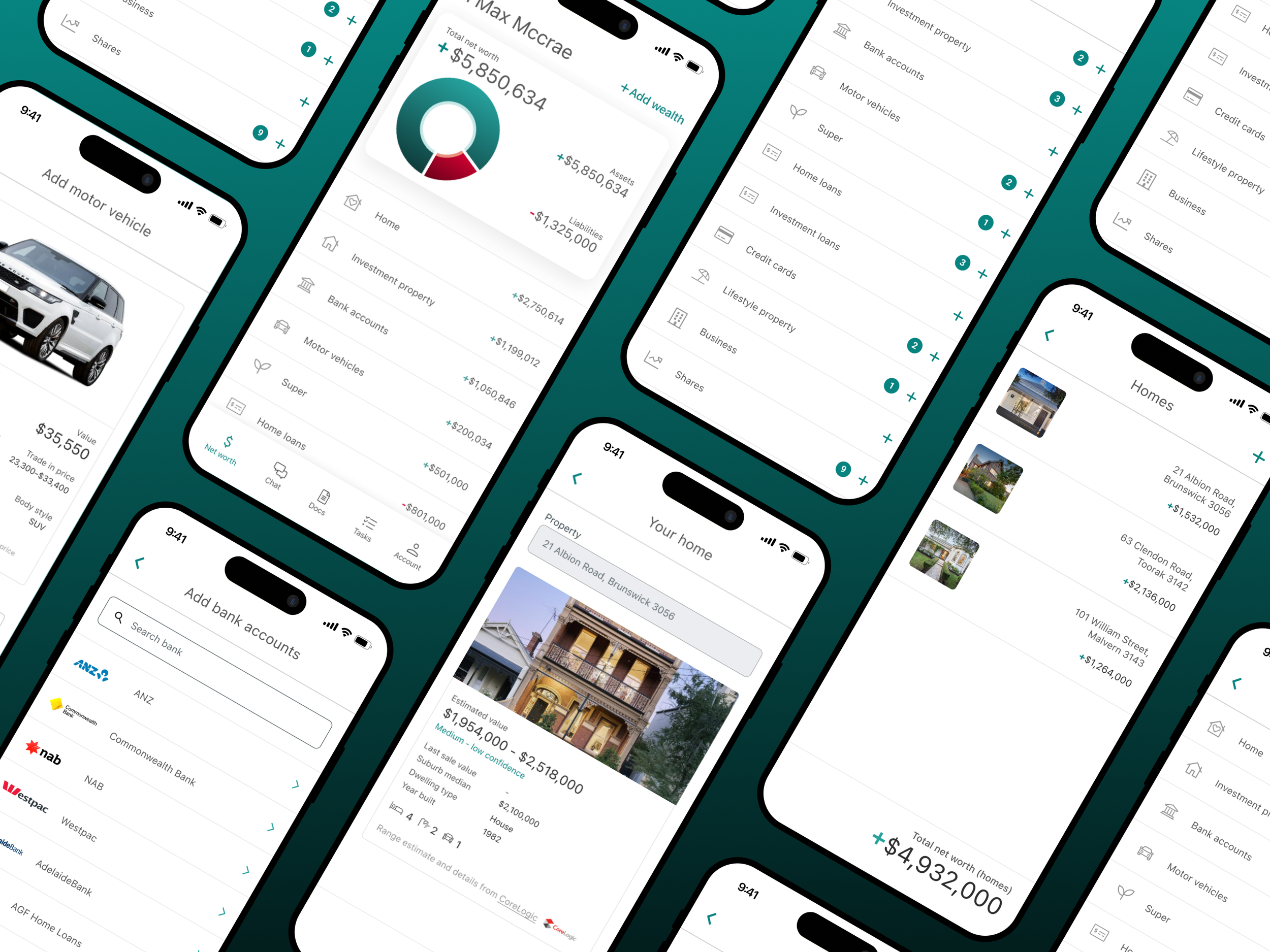
As the UI Designer on this project, I was responsible for mapping out the complete UI state flows across all 20 wealth item categories. This included defining the end-to-end user journey for adding each item, along with all associated success, error, and loading states. The work required close collaboration with engineers and the Product Manager to uncover edge cases and surface critical API-driven error scenarios, ensuring the UI could handle them gracefully and consistently.
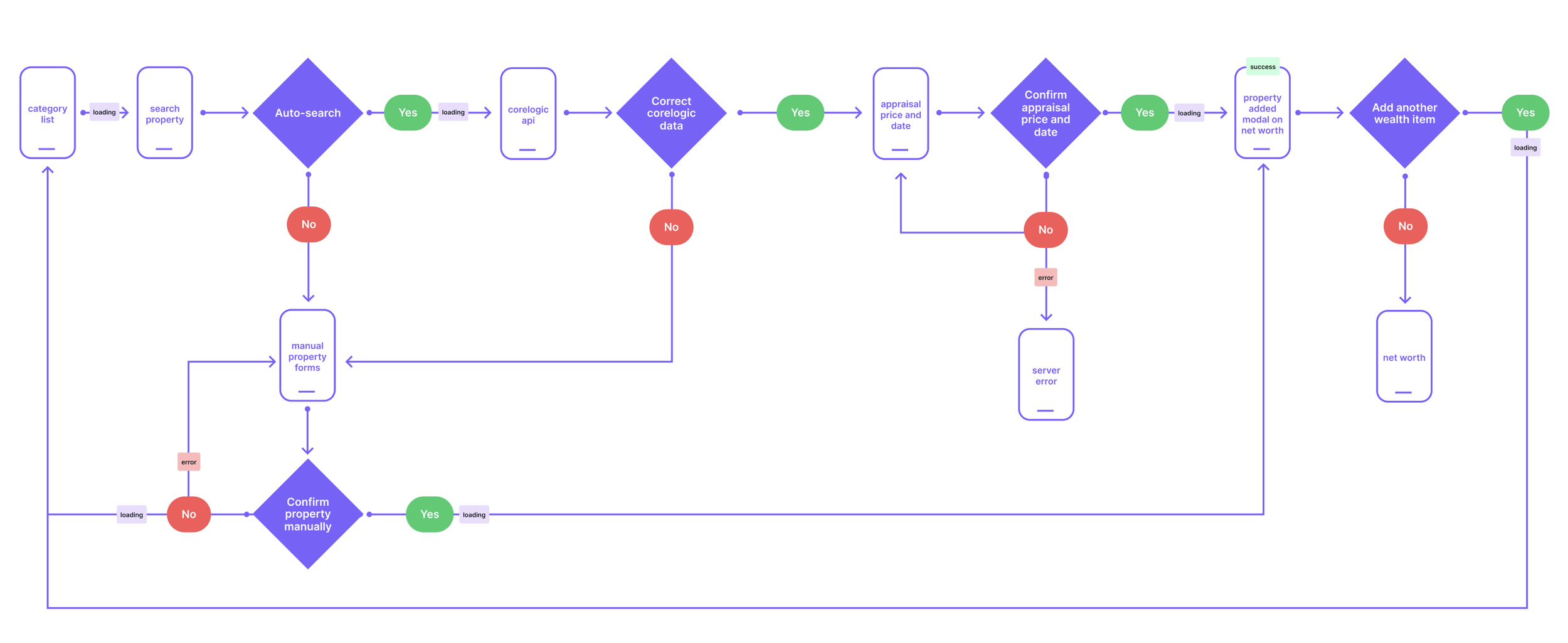
UI flow for ‘Add property’ to client’s net worth.
The previous wealth category screen was confusing, with inconsistent layouts and unclear actions. I redesigned the experience into a familiar, mobile-native list UI that leveraged common interaction patterns users already understand, making navigation faster and more predictable.
Key improvements included:
Scrollable list layout
Replacing grid-like tiles with a single, scrollable list improved scannability and reduced cognitive load.
Clear “Add” (+) affordances
A consistent “plus” button clearly indicated how to add new wealth items, avoiding confusion around primary actions.
Category badges
Displaying a badge with the number of assets per wealth category gave users immediate feedback and a stronger sense of progress.
This approach particularly benefited MyProsperity’s predominantly over-50s client base, increasing confidence and making the experience feel effortless even for users with lower tech literacy.
Familiar and scalable patterns
New Add ‘Bank accounts’ to client’s net worth
Reflection
This project reinforced the importance of designing for technical realities, particularly how early UI flow mapping, error state planning, and accessibility audits drive a smoother build process later.
It also highlighted the impact of using familiar, accessible patterns when designing for a broader, older demographic. Small improvements at the component and flow level made a measurable difference to both usability and adviser workflows.