Everyday Rewards
Digital Destination
Company
My role
👩🏻💻 Product Designer
Responsibilites
⚫️ Concept development & UX strategy
⚫️ UI design and responsive component design
⚫️ Prototyping, design documentation and accessibility
⚫️ Collaboration with product, engineers, brand and senior stakeholders
Project overview
Woolworths set out to transform the Everyday Rewards website into a more unified and intuitive experience, one that brought together all Everyday brands under a single, seamless destination.
At the time, the site was largely used for basic account tasks. It had low traffic, high bounce rates, and a confusing navigation structure that led to a high number of Customer Hub calls. On top of that, brands like Everyday Gifting, Everyday Extra, and Everyday Pay were all housed on separate websites, making it hard for members to see the full value of the Everyday ecosystem.
As a product designer, I worked across UX/UI to reimagine the site into a more helpful, intuitive, and engaging digital destination. The goal was to shift the perception of the website from a basic account portal to a place where members could discover value, self-serve with ease, and feel more connected to the brand.
We began with a deep dive into site analytics, member feedback, and stakeholder interviews. Several clear issues emerged:
Discovery and insights
Poor navigation
Key account related journeys (e.g. updating details, finding card info) were unintuitive and led to frustration.
☹️
Increased support calls
A significant volume of Customer Hub queries were due to account access or navigation problems.
☹️
Low engagement
The site attracted minimal traffic and high bounce rates. Users only came for basic account tasks, with little reason to explore.
☹️
Lack of program awareness
Members weren’t aware of the full value of the program, often discovering products like Everyday Extra or Insurance through external channels.
☹️
Brand fragmentation
Everyday brands and benefits were split across multiple sites, preventing users from seeing the full program value in one place.
☹️
Design principles
To guide our decisions, we aligned on these key principles:
One destination, many brands
Create a unified experience where members can discover all Everyday offerings in one place.
🌐
Clarity over complexity
Simplify site navigation and reduce decision fatigue.
🧹
Value first
Make it easy for members to understand how each product benefits them.
💎
Scalable and flexible
Design dynamic and responsive AEM components that can be shared with other eco-system websites (Woolworths and BIG W).
🧩
Accessible by design
Ensure the experience is inclusive and meets WCAG standards.
✌️
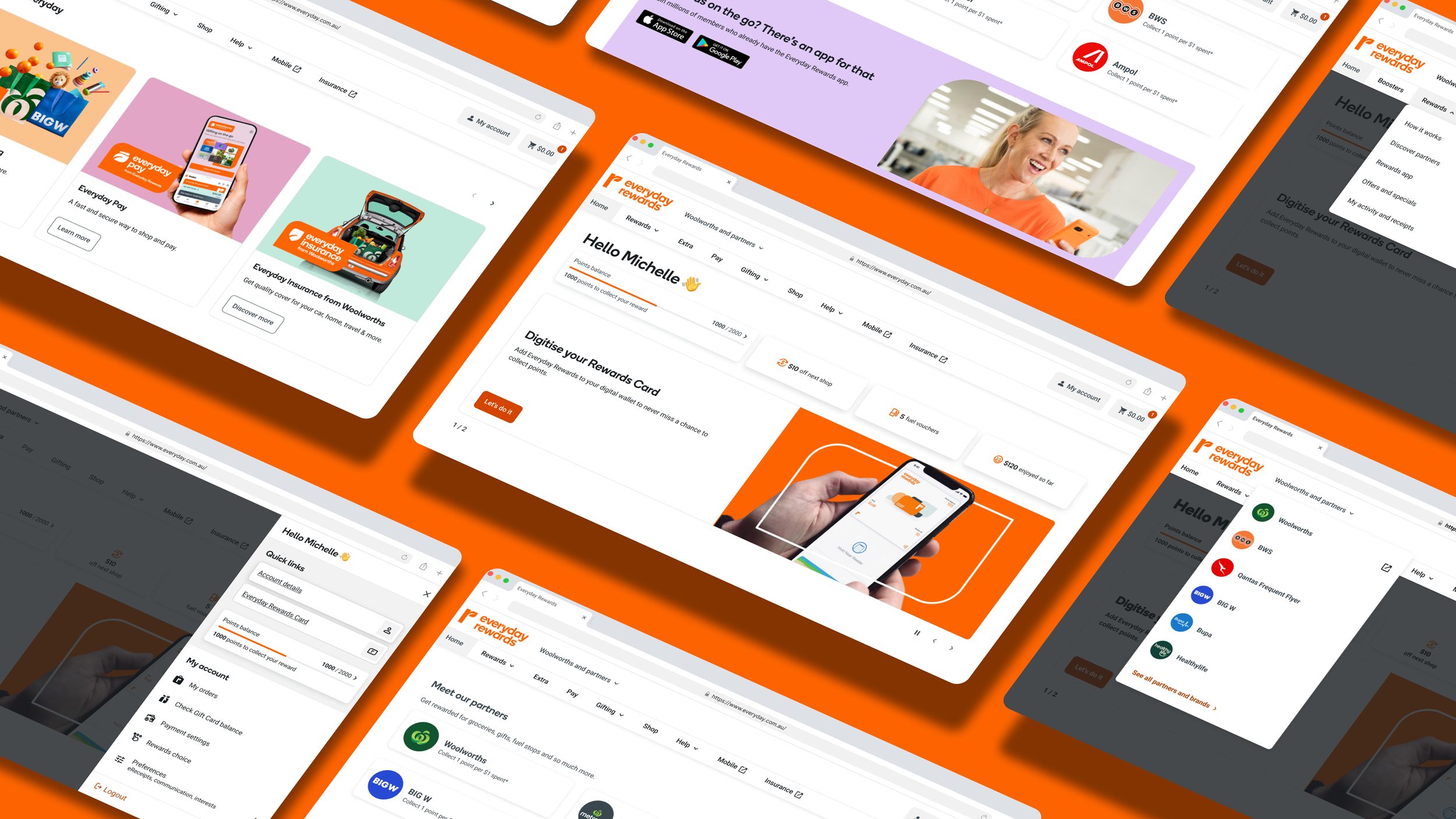
Final solution
The final solution delivered a connected, member-first experience that brought Everyday brands under one roof, while simplifying site navigation. Key features included:
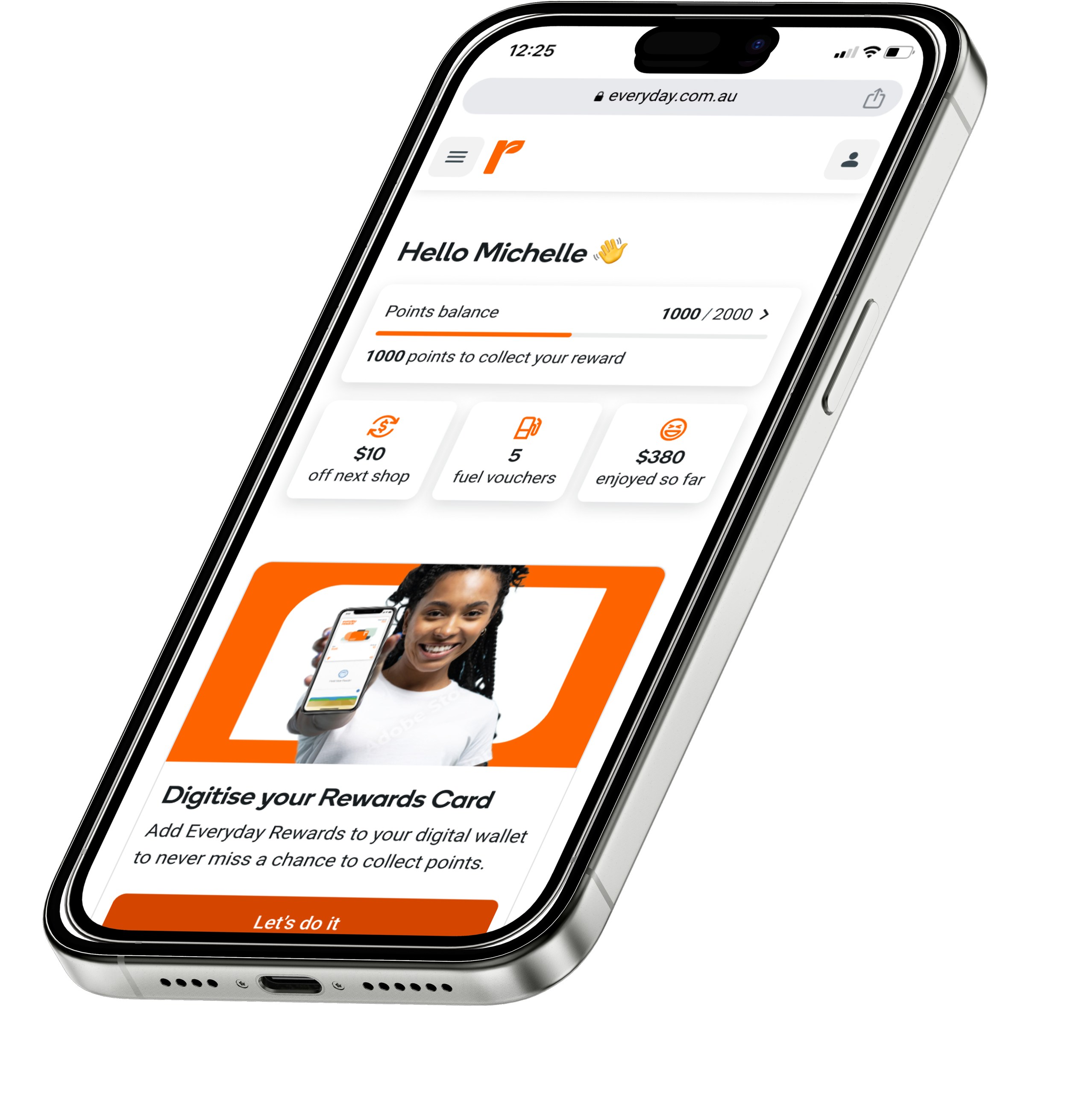
Restructured site navigation
Clearer paths to each brand and a simplified account section.
Content authorable AEM homepage design
Showcasing offers, cross-brand content, and personalised callouts.
Brand-specific hubs
Everyday Extra, Gifting, and Pay, using shared components and consistent UX patterns.
Design system foundation
Enabling reusability, accessibility, and seamless collaboration across squads, eco-systems (Woolworths and BIG W) and channels (app and web).
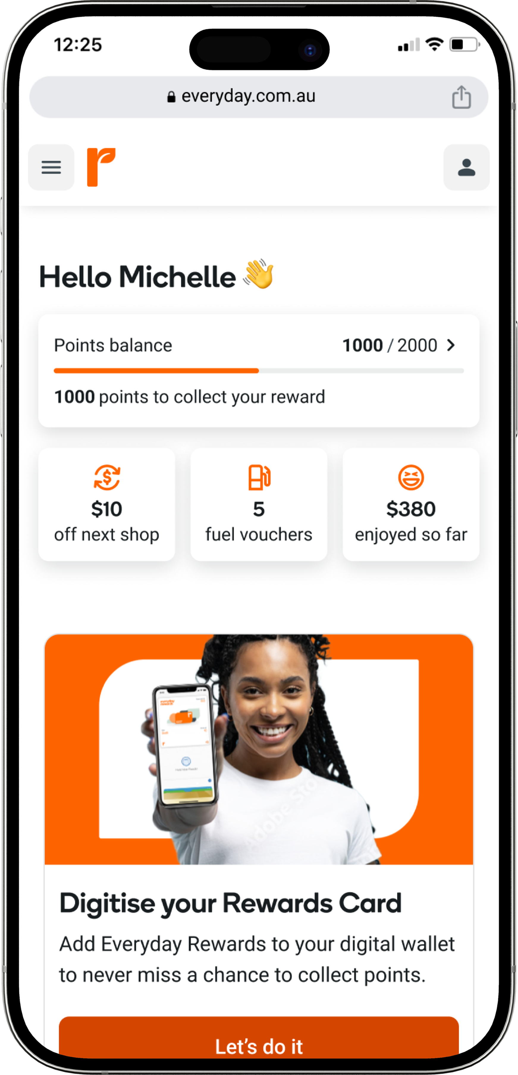
New authenticated homepage
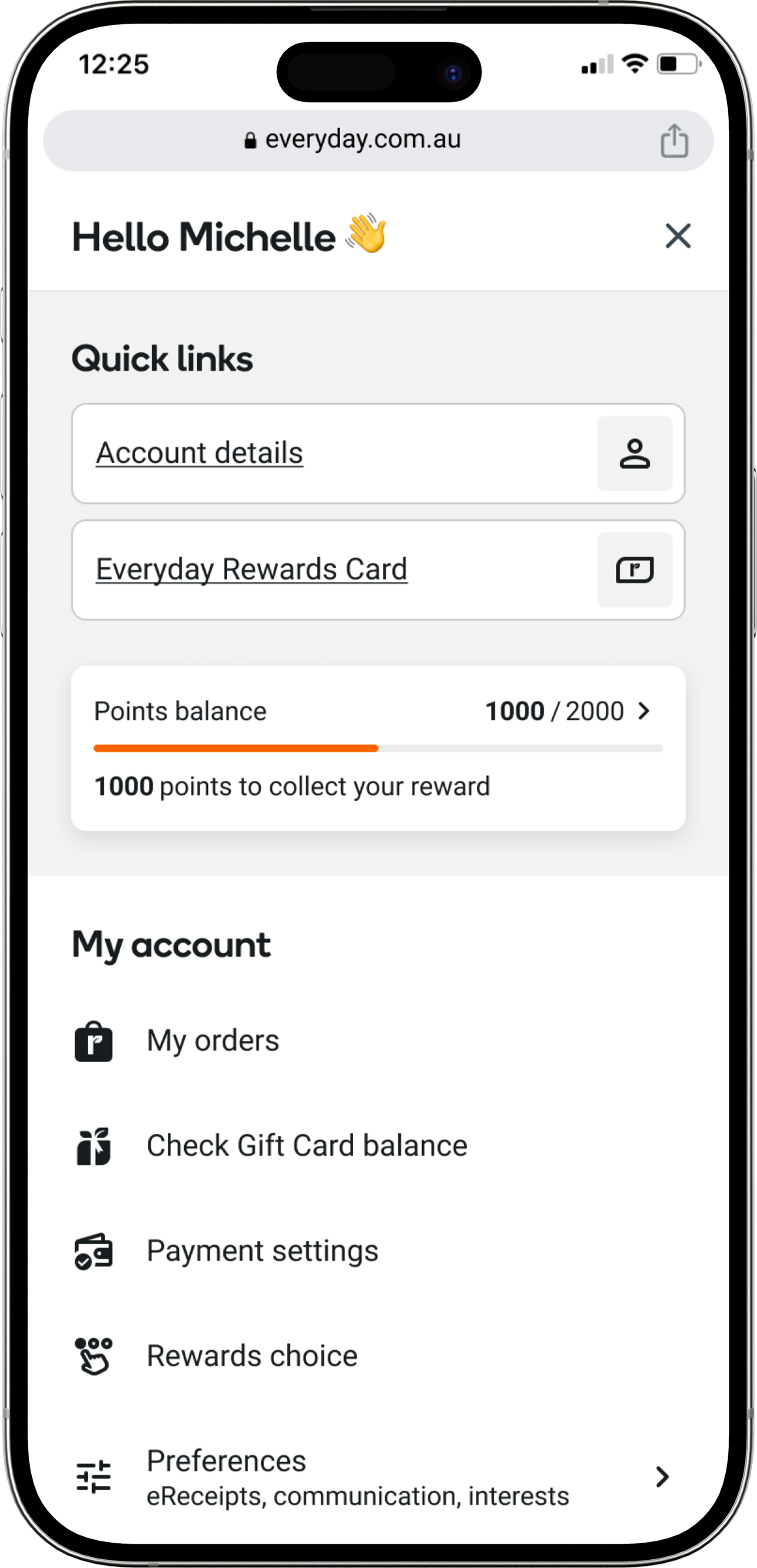
New account drawer
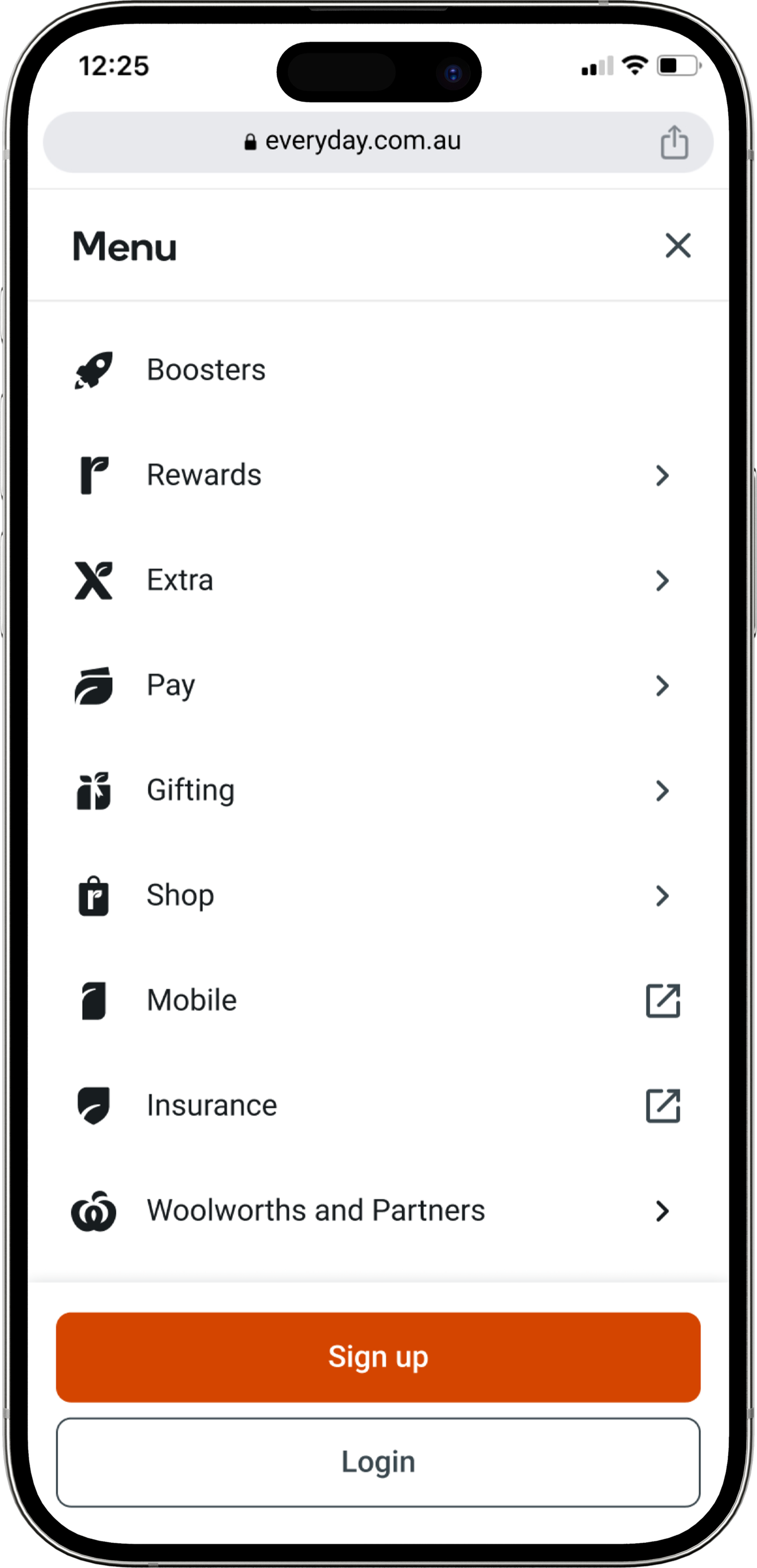
New primary menu
Outcome
Success measures
21%
increase in account page views in
34%
increase in site session times
15%
decrease in account related customer calls
12%
decrease in homepage bounce rates
Customer benefits
Clearer navigation
Customers can manage their accounts and tasks effortlessly from a single, intuitive platform rather than navigating multiple sites.
Improved discoverability
Members began exploring more than just Rewards, discovering Extra and Gifting more naturally within the journey.
Familiarity
A navigation experience aligned with the Woolworths website makes browsing more intuitive for existing customers, reducing learning curves.
Reduced friction
Consolidating all Everyday brands in one place eliminates confusion and inefficiencies, making it easier to explore offers and services,
Business benefits
Operational efficiency
A unified web experience allows for shared front-end components, reducing development time, effort, and costs while maintaining brand consistency.
Reduced support costs
Improved user discoverability of account tasks lowers customer drop-off rates and reduces customer services calls, decreasing operational expenses.
Stronger SEO & traffic growth
Enhanced SEO for the homepage drives more organic traffic, leading to higher engagement and increased conversions, especially as new e-commerce offerings (Everyday Gifting, Everyday Shop) expand.
Cross-brand synergies
A single digital destination strengthens the Everyday ecosystem, making it easier to introduce new services and increase customer retention.
Scalability
A well-structured, unified platform enables future growth, ensuring new propositions can be added efficiently without significant infrastructure changes.
Reflection
This project highlighted the power of simplifying complexity through thoughtful design. By rethinking how we structure and present value across multiple brands, we created a web experience that not only meets user needs, but also brings the full Everyday ecosystem to life. It was a meaningful step toward building a more connected, accessible, and rewarding experience for all members.